Quantcast
Channel: object of the day – Cooper Hewitt, Smithsonian Design Museum
Viewing all 447 articles
Browse latest View live

Elegant Egg Cups

$
0
0
Cynthia Trope
Stacking egg cups. Denmark, 1958. Designed by Kristian Vedel (Danish, 1923-2003), Manufactured by Torben Ørskov & Co. Gift of John and Paul Herzan, 2005-18-1/3.

Kristian Vedel is primarily known as a furniture designer, trained by the Danish architect-designer Kaare Klint and strongly influenced by Klint's standards of economy, function and simplicity. Vedel established his own studio in 1955. These stacking egg cups are one of his early innovative designs, part of the Gourmet line of plastic tableware from about 1958. Manufactured by Torben Ørskov & Co., they are made of melamine, a hard, durable, heat resistant plastic still popular for table and kitchen goods today. The egg cups were produced in white, black and red. The simple, circular molded forms show a sculptural lightness and refinement. Their rims, wide enough for a small spoon, taper to such a fine edge that they are almost sharp.

In the early-to mid-1950s, Torben Ørskov started working with designers to explore what could be achieved with melamine, a relatively new plastic at the time. The company wanted to show that it could be used to produce finely sculpted forms of high quality. Surprisingly, this experimentation with melamine and the idea of stackable plastic ware was somewhat influenced by American products Vedel and other Danish designers saw at the 1954 exhibition of American decorative arts, in Copenhagen. One Danish critic noted that American design emphasized functionalism and the "art of simplification." There was a large contingent of plastic kitchen and dining wares, including Russell Wright's and George Nelson's first stacking table services in plastic. Vedel began to design the Gourmet range around 1956, and the basic line went into production two years later.

By the early 1960s, this international story seemed to come full circle—the egg cups and other Gourmet items were available to American consumers at Design Research, the innovative retailer of modern design, founded in Cambridge, Massachusetts in about 1953. Design Research, a great proponent of the Scandinavian Modern style, went on to open stores in New York and San Francisco. The firm became an influential marketer of every aspect of the modern lifestyle in the 1960s and 70s—from clothing and textiles, to furniture, to goods for the kitchen and dining table.

Museum Number: 
2005-18-1/3

A Wallpaper View of Early New York

$
0
0
Gregory Herringshaw
Sidewall, USA, 1830; Block-printed on handmade paper; Gift of New York State Historical Association, 1985-15-1

This wallpaper shows a view of New York harbor as seen from Castle Williams on Governor's Island. The design features a landscape view that alternates with an eagle bearing an E Pluribus Unum banner. The paper is woodblock-printed in grisaille or shades of gray with a green filigree running through the design that outlines and connects the different elements. The foreground of the landscape view shows a sentry walking around the base of Castle Williams, a nearly circular fort built between 1807-11. Castle Williams was considered to be a state-of-the-art fortification and remained influential in fortress design for decades to come, so it makes sense to include this structure in a patriotic wallpaper. A variety of large and small vessels sail the harbor including paddlewheel boats and tall ships. The Manhattan skyline can be seen in the distance. This print of the eagle is based on the Great Seal of the United States, whose eagle clutches a banner in its beak, carries thirteen arrows and an olive branch in its talons, with thirteen stars overhead, each of which symbolize the original thirteen states. Twenty stars appear over this eagle’s head, and if symbolic in this use, could date the paper at 1817 when Mississippi became the twentieth state.

Landscape views appearing on wallpaper designs were frequently copied or inspired by period prints. There was a note on this object’s catalog record stating that was most likely the case with this wallpaper. Knowing some of the key elements of this scene I went onto the Museum of the City of New York’s website and found a very similar view of New York harbor as viewed from Governor’s Island dating to 1820. The sentry walks around the fort, ships are sailing in the harbor, Manhattan can be seen in the distance, and the rolling waves in the print have been replaced by barrels and other items on shore.

http://collections.mcny.org/C.aspx?VP3=SearchResult_VPage&VBID=24UAYWPK8...

Museum Number: 
1985-15-1

A Magic Carpet

$
0
0
Willa Granger
Drawing, Proposal for Pershing Square, 1986. James Wines. Gift of SITE, 1993-115-6.

“Sustainability,” “green,” “eco-friendly”: these terms have become bywords associated with the contemporary city. With the inception of LEED certification in 1998, and the advent of sustainable technologies such as solar panels, today’s urban designers are increasingly immersed in the conversation around sustainable design. Architect and sculptor James Wines (b. 1932), however, has been grappling with these questions since the early 1970s. His work has proven so influential within the architecture community that in 2013 Wines was recognized with a Lifetime Achievement award from the Cooper-Hewitt as part of their National Design Awards program. Wines, president and co-founder of the architectural firm SITE, has used his design platform to transform the traditional hierarchy between architecture and nature, the tendency to “discard”[1] vegetation as secondary to our built surroundings, proposing instead an assimilation of structure and environment. “Buildings conceived of as integrations of structure and landscape,” he writes, “are mutable, metamorphic, and evolutionary, constantly conveying new levels of information.”[2] For Wines, built, natural, and social contexts are in perpetual dialogue.  

Wines’ 1986 design for the Pershing Square redevelopment in Los Angeles illustrates the architect’s unique design philosophy. Though the project ultimately went to architect Ricardo Legorreta and landscape architect Laurie Olin, Wines’ proposal is commendable for its effort to revolutionize the historic square while paying homage to the surrounding context. Wines was inspired by the city’s topography, a “vast, gridlike carpet with rumpled corners where the hills surround the central plain,”[3] as well as the city’s cultural mosaic. Using the park’s original footprint, Wines developed an undulating topography around the square’s periphery, leveling the space into a central valley at the square’s nucleus.


Drawing, Proposal for Pershing Square, 1986. James Wines. Museum purchase through gift of Lucy Work Hewitt, 1993-115-3.

Wines further divided the square into a pattern of modular grids. Each module represents a unique “mini-environment” with its own vegetal and aesthetic profile derived from the surrounding city. Cooper-Hewitt’s two drawings illustrate the logic of Wines’ scheme. The “Selection of Los Angeles Theme Modules” catalogues the various environments Wines developed for the Pershing Square project. These included a Japanese Garden , an “auto archaeology” module with a half-buried car in recognition of the Los Angeles auto culture, a “Spanish Archaeology” module complete with citrus trees and bougainvillea, beach, tropical, and desert modules in honor of the state’s varying climates, as well as a series of fountains. Wines referred to his scheme of modules as a “magic carpet,”[4] which, when paired with the dynamism of the park’s undulating topography, imbued the space with a “visual drama.”[5] Cooper-Hewitt’s second drawing shows how these modules interlock throughout the square, flowing from level to raised ground, broken by pathways and a trellised processional at the park’s center. These drawings further attest to Wines’ skill as a draftsman, and in particular his belief in hand drawing as a crucial component of a design’s evolution, together with computer renderings. The varying line qualities and textures suggest the diverse amalgamation of vegetal and visual features throughout his design, which, like the mosaic of contemporary LA, combine into a unified whole.


[1] Wines, James. “Passages: the Fusion of Architecture and Landscape in the Recent Work of Site.” Architectural Design. Vol 67. No 1. January-February 1997. 32.

[2]“Passages” 32.

[3]“Pershing Square.” Site. New York: Rizzoli, 1989. 214.

[4]“Pershing Square” 214.

[5]“Pershing Square” 214.


Museum Number: 
1993-115-6

Arabian Nights

$
0
0
Gregory Herringshaw
Sample book, Arabian Nights from Mezzotone Papers, Ilonka Karasz (American, b. Hungary, 1896–1981), 1948; Produced by Katzenbach and Warren, Inc.; New Canaan, Connecticut, USA; Mezzotone print on paper; Gift of Katzenbach and Warren, Inc., 1959-134-1-22

Arabian Nights is one mural from a collection of five produced in 1948. The mural is divided into three distinct views, the two ends showing building exteriors while the center view looks through a colonnade into a courtyard. Through this view one can see all manner of decorative fences, roof tops, a cupola, even a pair of nesting birds. The two end views show elaborate tile work and horseshoe-arched windows, both common features in Islamic architecture. This mural was printed on a single horizontal panel measuring 37 x 95 inches and could be installed in a variety of ways: it could be used by itself, it could be hung with multiple panels end to end, or it could be installed in brick fashion to fill an entire wall.

Ilonka Karasz began designing wallpapers in the 1930s but her wallpaper career didn’t take off until the postwar period when she designed exclusively for Katzenbach & Warren. She believed walls should be rendered as a flat surface, and her designs present an unusual, surreal perspective not true to nature. Her designs were printed using a variety of media, including machine printing and the new Mezzotone process, a blueprint method introduced by Katzenbach & Warren. Mezzotone prints were available in a variety of ink and paper colors, including sepia, burgundy, blue, and yellow. All of Karasz’s designs printed in the Mezzotone process were hand drawn to scale in graphite and ink on linen. Karasz preferred this printing technique because it picked up the delicate line quality and textural aspect of her drawings.
 

Karasz immigrated to the United States from Hungary in 1913, and became one of very few women working in the design field. She was also the first woman admitted to the Royal School of Arts and Crafts in Budapest. While she worked with a variety of media including wallpaper, silver, textiles, and furniture, Karasz was probably best known for her New Yorker magazine cover illustrations, designing her first cover in 1925 and creating a total of 186.

Museum Number: 
1959-134-1-22

Cleaning Your Plate for Your Country

$
0
0
Laura Williams
Poster, Food Is A Weapon, 1943. Published by Office of War Information.  1987-24-23

During WWII, the US government depended on Americans to volunteer in the war effort. Over 85 million Americans--nearly two thirds of the population--purchased war bonds providing much needed financial support. Women entered the workforce in large numbers helping to produce the thousands of ships, tanks, and airplanes required overseas.  Food shortages were a major problem during the war, and the government asked Americans to become as self-sufficient as possible.

This 1943 poster encouraged members of the public to finish everything on their plates and to not waste food. A note that accompanied this poster explained that since the military would require much of the commercially produced canned food that year, Americans needed to preserve their own food to get them through the winter months. Growing “Victory Gardens” and using food stamps were active ways that the public could further help the war effort.

This object is one example of the many posters that the US government mass produced throughout the 1930s and 40s. The Works Progress Administration (WPA) developed a new silk-screening process that could reproduce color posters at a rapid pace. Posters were hung on factory walls, in store windows, and along sidewalks as a constant reminder to the public about their patriotic duty and wartime responsibilities.

Laura Williams is a Masters candidate in the Museum Studies program at New York University. Interested in pursuing a career in curatorial research of United States cultural and social history, Laura earned her Bachelor of Arts in American Studies and History from the University of Maryland in 2013. She currently works with the National Design Awards at Cooper-Hewitt.

Museum Number: 
1987-24-23

Jennifer Morla: Experimental Typography

$
0
0
In celebration of the milestone 20th anniversary of the National Design Awards, this week’s Object of The Day posts honor National Design Award winners.

What does “typography” mean to you? Does the word stir up contempt for Comic Sans and Papyrus, or does it conjure a death match between Times New Roman and Helvetica? For many of us, the word “typography” means “fonts.” Yet the art of typography encompasses much more than choosing typefaces. Designers use scale, spacing, layout, contrast, grids, hierarchy, and more to arrange content in meaningful and expressive ways. A typographic message can stand up and stand out—or gracefully recede to the background.

Jennifer Morla has experimented with typography since 1978, when she began designing motion graphics for a PBS television station in San Francisco. After founding Morla Design in 1984, she became a leader within the Bay Area’s dynamic design scene. Morla has used color, pattern, photography, and editorial wit to bring grit and sparkle to visual communications for consumer brands and cultural institutions. Morla has a special gift for typography. She mixes, matches, splices, and overlaps lines of text to generate provocative interpretations of art and ideas.

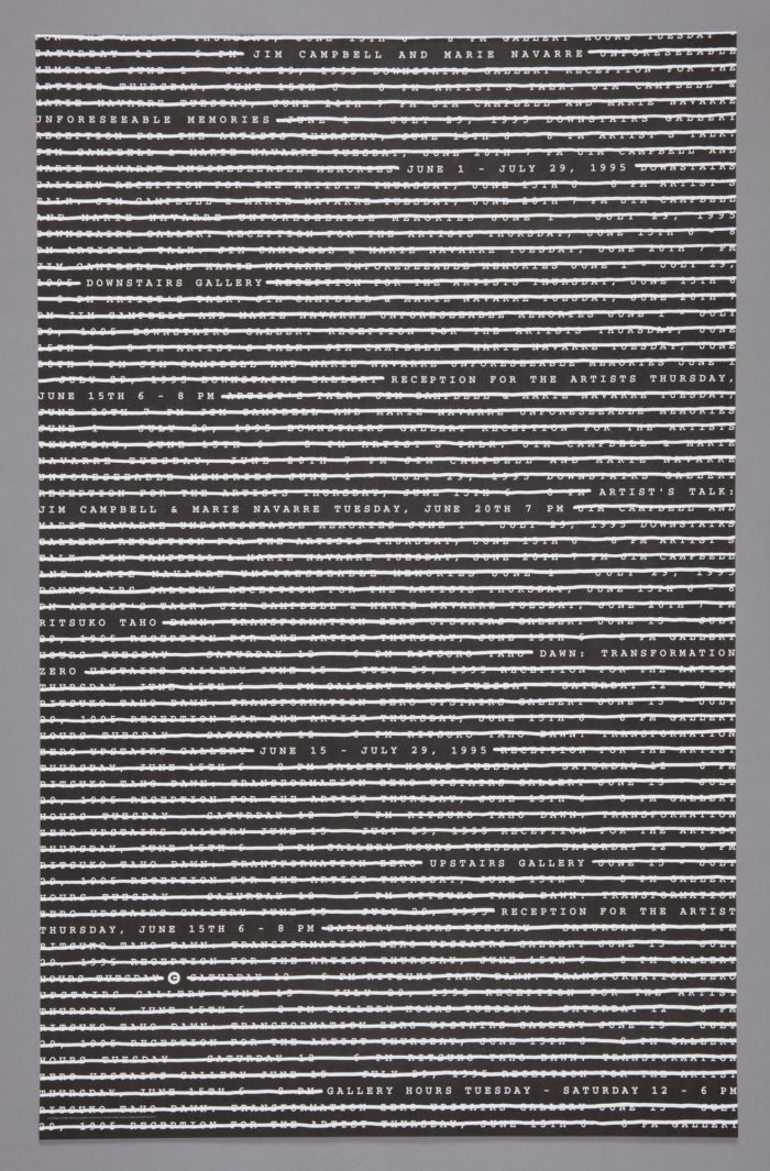
Cooper Hewitt recently acquired nearly two dozen posters and other works by Morla, who received the National Design Award for Communication Design in 2017. A group of black-and-white posters from the 1990s demonstrates her mastery of typography as an expressive medium. San Francisco’s Capp Street Project (now part of the Wattis Institute) offers residencies and exhibition opportunities to local artists. While traditional museum or gallery posters feature reproductions of artists’ work, Morla uses type to embody themes and concepts. For the exhibition “Unforseeable Memories” (1995), she covered the poster with a field of small type, printed in all caps in a simple, monospaced typewriter font—and then she crossed out most of the text. All that remains visible are the particulars concerning the event. Paradoxically, the obliterated lines serve to highlight the remaining text, functioning like underscores. In another poster created the same year, overlapping words convey collaborations among a group of artists. Individual names emerge from the crowd.

For a campus gallery at the California College of Arts and Crafts, Morla assembled fragments and shadows of letterforms into vibrant bursts and clusters. Crisp horizontal bands of text stand out against these gestural masses to announce the title and dates for each exhibition. As a series, these black-and-white posters gave the gallery a recognizable voice while singing different melodies.

Morla’s posters contributed to the flourishing of typographic experiment during the dawn of digital typography. The new design tools that came of age in 1990s freed designers to manipulate type in direct and immediate ways. In place of manual cut-and-paste and costly galleys of typesetting, designers could manipulate the scale, orientation, and sharpness of text and image. Philosophically, designers were questioning modernism’s emphasis on simple, direct messaging in favor of layered complexity. Typography could challenge readers to look closer. In this influential body of work, content becomes visible against a turbulent sea of form and counterform, assertion and deletion.

Ellen Lupton is Senior Curator of Contemporary Design at Cooper Hewitt, Smithsonian Design Museum.

Weaving Wonders of Richard Landis

$
0
0

American weaver Richard Landis’s works are characterized by complex design systems that echo the logic of their construction with a limited vocabulary of materials, texture, geometric forms, and colors. From his earliest days at the loom, Landis decided he would work only in plain weave and within the opportunities offered by handwoven, loom-controlled design. He taught himself doubleweave to expand what could be achieved within his self-imposed boundaries.

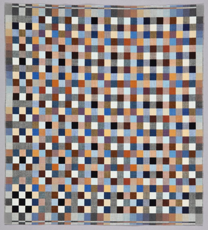
Nucleus (1976) is a superb example of Landis’s technically and aesthetically disciplined handwoven double-cloth. It is a diminutive piece, only eighteen and three-quarters inches high by seventeen inches wide, woven in very fine cotton thread. Designed in collaboration with graphic artist Craig Fuller, it uses a visual program based on a grid of small squares, thirty across by thirty down.

It is woven in a classic “checkerboard” style of loom-controlled block double-cloth. Rather than using only two colors as in a traditional checkerboard, Landis uses a modulated palette of colors, inspired by the subtle tones of the desert landscape surrounding his Arizona home: black, white, grays plus several shades of blue and of its compliment, orange – twelve different colored threads in total.

Landis’s program allows for a balanced and systematic depiction of all seventy-eight possible tones and half tones that may be constructed from the twelve different color threads. The use of very fine, smooth threads woven in plain weave allows for the appearance of definite tonalities and the rendering of a perfectly flat colored surface. “…For while my medium is weaving, my formal concerns are those of a painter. The firm tabby surfaces I weave form a canvas,” Landis said. “In my work, the canvas is the painting.”[1]

In Nucleus the colored warps and wefts are precisely arranged, with a subtle symmetry. The warp threads in column one are the same colors as the weft threads in row one; the warps in column two are the same as the wefts in row two and so on across the weaving. Landis then alternates the warp and the weft respectively that appear in each square, in the same sequence, across the full width and height of the textile. Thus what might appear as a random arrangement of colored squares in the grid is in fact deliberate. As a result, the first row and the first column of squares as seen from each respective corner of the composition have the same color tones, similarly for the second row and second column, and so on, except that the warp and weft colors are reversed. So, for example, the fifth square in the first row is a half tone of blue warp and gray weft and the fifth square in the first column is a half tone of gray warp and blue weft. The diagonals are full tones. The resulting juxtaposition of different tonalities, as well as the changing orientation of the threads multiplies the color relationships, allowing for what Landis called “reiteration without repetition.”[2] Thus, even with its flat, uniform surface and repeated color sequences, Nucleus is a lively and energetic composition.

Richard Landis stopped weaving in 1995, but his disciplined geometry and masterful use of color are fresh and fascinating today.

Maleyne M. Syracuse is an avocational weaver and an independent art historian specializing in textiles and fine craft. She is President of the Board of Directors of Peters Valley School of Craft in Layton, NJ and a past Treasurer of the Textile Society of America.

[1] Richard Landis, Artist’s Statement, quoted in Joanne Rapp Gallery, Richard Landis, undated. Object/Artist Files, Textile Department, Cooper-Hewitt National Design Museum, New York, NY.

[2] Richard Landis quoted in Barbara Cortright, “Richard Landis: The Prismatic Needle’s Eye,” ArtSpace (Fall 1979), 37.

Viewing all 447 articles
Browse latest View live