Quantcast
Channel: object of the day – Cooper Hewitt, Smithsonian Design Museum
Viewing all 447 articles
Browse latest View live

A Cabinet of Surprises

$
0
0
Sarah D. Coffin
Writing Cabinet,Designed by Eleanor Mabel Sarton (British, 1878-1950), Belgium,1913, Various woods, mother-of-pearl, ivory, silk, Gift of the Estate of Eleanor May Sarton, 1996-9-1

This cabinet, that looks more like a dining room side cabinet than a writing cabinet at first glance, caught my eye when I first saw it upon arriving at Cooper-Hewitt as a curator. I considered the Arts and Crafts movement an area in which I had some knowledge, so I was fascinated that I had to try to guess who designed this piece and where. When I looked at it from the outside, I thought it might be British, thought about Belgium, but felt I should look for comparable objects--which I did but without much luck. To complicate matters, the inlay struck me as more Austrian or German, especially on the inside. I felt determined that I should solve the mystery without looking it up in the records for help. Eventually I had to look it up and discovered that I had heard of the designer, but in a different context. She was also a portrait miniature painter, textile designer, interior designer and mother of the poet May Sarton. I had seen and catalogued a few very elegantly painted miniatures by her, created during the first decade of the twentieth century, but certainly could not have connected her with furniture from that. The geography of the piece seems to echo her biography. The designer, born in Britain as Eleanor Elwes, married a Belgian historian, George Sarton in 1911 and lived there until Germany invaded Belgium in 1915 when they fled to the United States. The cabinet was part of a suite she designed for the firm L’art Décoratif in Brussels, and was exhibited at the International Exhibition in Ghent in 1913.

cabinet in Ghent

According to family papers, all the cabinetwork was made in Belgium but the inlays were executed in Bavaria. So, here we find a bit of British, mixed with a lot of Belgium, and a bit of Austrian-influenced German inlay. The interior compartments, also decorated with the elegant stylized inlays, reflect a desire for removing clutter into these compartments, a concept that harmonized with the arts and crafts aesthetic of clean lines. Yet the use of rich woods and mother-of-pearl, also found in Vienna and later in Art Deco furniture, shows an appreciation of the materials to enhance a simple form.

cabinet interior

The acceptance of a woman designer as a full-fledged designer was happening in Glasgow and Vienna around 1900, in Glasgow with the Macdonalds, and in Vienna with a few of the Wiener Werkstätte designers, but mostly as textile and jewelry designers. Mabel Sarton was a great rarity in the world of furniture design as a woman. The tale goes on with her arrival in the United States, and her furnishings and decorating business in Washington DC that included her embroidery, her retailed goods and her teaching applied arts. But that is for another day.

Museum Number: 
1996-9-1

Coffee Talk: Celebrating the Birth of Jutta Sika

$
0
0
Adriane Dalton
Coffee set. Designed by Jutta Sika, manufactured by Wiener Porzellan Josef Böck, produced by Schule Professor Koloman Moser. Austria, ca. 1902. Museum purchase from Charles E. Sampson Memorial Fund, 1986-83-1/5.

Born on this day in 1877, Jutta Sika was an Austrian designer working in a variety of different media. Sika received formal training in both graphic and costume design but is best known for her ceramic and glassware designs. In 1895 Sika studied at Graphische Lehr und Veruchsantalt (Graphic Education and Research Institute) under Joseph Eugen Hörwarter and later enrolled at the Kuntsgewerbeschule (School of Applied Arts) where she studied under Friedrich Linke, Koloman Moser, Rudolf Ribarz, and Alfred Roller.[1]

It was at the end of this second portion of her formal education that Sika founded Wiener Kunst im Hause (Viennese Art in Home), a group of five men and five women who were students from the Kunstgewerbeschule. The successful reception and praise of the group’s designs are noted as being a potential catalyst for the formation of the Weiner Werkstätte (Viennese Workshops), founded one year later by Kuntsgewerbeschule professors Koloman Moser and Josef Hoffmann. Both Wiener Kunst im Hause and Weiner Werkstätte were founded on the principle of “Gesamtkunstwerk” (total work of art), and focused on creating objects for a harmoniously unified space through the design of the textiles, furniture, and functional objects.[2]

The women of the Weiner Kunst im Hause, who were responsible for the design of both ceramic and textiles, used patterns evoking traditional Austrian folk art.[3] This coffee set, though certainly compelling on its own, would likely have existed as part of a series of similarly designed objects in a range of materials meant to contribute to a unified sense of design within the home. This same sense of unification exists even within this collection of objects that make up the coffee set.

The red circles on the set’s surface, some overlapping to form a cluster while other smaller circles float freely, are not just an afterthought applied to an existing ceramic form. Rather, each piece in the set is intentionally designed in both surface and form, and maintains a sense of unity and continuity even among objects with varying functions. This is apparent in the bottom heavy curves of the vessels and in the slight curl of the saucer’s lip, each individual form seeming to invite the warmth of coffee, the viscosity of cream, and the preciousness of sugar. The handles and lids that accompany these forms are shaped in such a way that their presence disrupts neither the form nor the surface design. It is each element of the coffee set’s five individual pieces that culminate in allowing it to become a small Gesamtkunstwerk.

Adriane Dalton is a graduate student in the History of Decorative Arts and Design at Parsons The New School for Design. She is a studio jeweler, illustrator, and writer whose interest in adornment overlaps both her artistic and academic pursuits.

___________________________________________________________________________________________________________________

[1] Biographical information from Neue Galerie. Please see: http://www.neuegalerie.org/collection/artist-profiles/jutta-sika

[2] Neue Galerie, “Jutta Sika,” accessed August 15, 2012, http://www.neuegalerie.org/collection/artist-profiles/jutta-sika

[3] Rebecca Houze, “From Wiener Kunst im Hause to the Wiener Werkstätte: Marketing Domesticity with Fashionable Interior Design,” Design Issues 18 (2002):3.

Museum Number: 
1986-83-1/5

A Timeless Portal

$
0
0
Kimberly Cisneros
Pair of gates from the Chanin Building, Rene Paul Chambellan, 1928, Gift of Marcy Chanin. 1993-135-1,2

Originally designed and installed in the entrance to the executive office suite of the Chanin Building, this finely crafted pair of gates provide an excellent example of the important role metalwork played in defining the Art Deco style of New York skyscrapers and other buildings built from the mid-1920’s into the early 1940’s. American sculptor Rene Paul Chambellan created the bronze gates for Irwin Chanin, an architect, designer, and real-estate developer whose vision for the building reflected his own optimism about capitalism, democracy, New York City and America. 1

Chambellan’s gates are dynamically constructed: a  ninety-inch wide span of wrought iron and bronze designed with geometric decoration including narrow rectangular sections of irregularly stacked cogwheels, trapezoidal sections with radiating arcs, and a segmented border depicting stacks of coins.  Overall, Chambellan's gates exude a wonderful energy and sense of motion. You can almost imagine the lightning bolt-like forms and zigzag lines racing up and down the gates, the rise and fall of the coins and the turning of the cogwheels!  

This pair of gates has inspired me to think about my own experience living in New York City in the twenty-first century.  The saying, “If you can make it here you can make it anywhere,” rings true for this transplanted New Yorker. I often grapple with the city’s energy that can be electrifying and inspiring, but at other times overwhelming and exhausting.  Today’s world is so fast paced, from the internet that provides us with information at lighting speed, to the nation’s constant state of economic change.  Therefore, I believe Chambellan’s gates are timeless and that he has created a portal for both Chanin’s vision of the American Dream in 1928 and what it has become almost a century later. 

Donated by the Chanin family, these gates became part of Cooper-Hewitt’s permanent collection in 1993. The gates have been featured in the Museum’s 1998 exhibit, “Opening Our Doors” and in traveling exhibitions across the world including the Suntory Museum in Osaka, Japan; the Victoria and Albert Museum in London, England; and the Royal Ontario Museum in Toronto, Canada.

1  Pilgrim, Dianne H. “The Chanin Gates.” The Magazine Antiques. January 1997:  224-225. Print.

Museum Number: 
1993-135-1, 2

A Greek Embroidered Band

$
0
0
Kimberly Randall
Embroidered band, 18th century, Gift of Richard C. Greenleaf, 1953-60-2.

In 1953, Cooper-Hewitt received from Richard C. Greenleaf (1887–1961) a gift of twelve pieces of embroidery and lace. One piece was an unusual band made in the Greek Islands in the eighteenth century. Embroidered using long-armed cross stitch in red silk on cream-colored linen, a portion of the design was copied from a much older pattern by the Italian designer Giovanni Andrea Vavassore (1510–1572). His book of embroidery designs, Esemplario di lavori or "Models of works" was published in 1532. While printed pattern sheets likely circulated before the sixteenth century, the bound books with designs for embroidery and cutwork proved to be a popular format in Europe. Published books came mainly from cities in Germany and Italy – centers of established international trade where higher rates of literacy guaranteed strong sales. In many cases, these early sixteenth century pattern books had designs that were neither novel nor highly sophisticated as the intended audience was not the expert needle worker. These are readily distinguishable as their dedications to virtuous work reveal that the patterns were meant to be easily executed by a different group – women of the aristocratic classes. Early patterns books were used repeatedly as sources of inspiration with some amateur needle workers taking patterns from different books to create new designs. They also became useful tools for teaching embroidery, and for this reason it is not surprising that these books had enduring value that extended to more remote European locations.

Page from Vavassore's Esemplario di lavori with a bird and cornucopia.

Red and white embroidered bands bearing designs from pattern books are ubiquitous in textile collections. They were used to decorate many types of domestic linens such as towels, bedding and cushion covers especially in Italy and Spain, which explains why so many examples exist today. Designs range from simple geometric shapes to more complex patterns showing architectural elements, human figures, animals and mythological creatures. Cooper-Hewitt’s band has a complex arrangement of birds and mermaids along with overflowing cornucopias and other scrolling shapes. The confronted birds with cornucopias are copied from Vavassore’s pattern book, but the addorsed mermaids with scrolling forms, a very common motif of the sixteenth century, are from another source. The top half of the design is reflected below in a mirror image.

Museum Number: 
1953-60-2

A Frozen Explosion

$
0
0
Cynthia Trope
Porca Miseria hanging lamp. Designed by Ingo Maurer (German, b. 1932), Manufactured by Ingo Maurer GmbH. Germany, 2000. Gift of Peter Norton, 2010-16-1.

Fascinated by what he calls the "magical and mystical" qualities of light, lighting designer Ingo Maurer plays with conventional notions of brightness, shadow, and color. Trained as a typographer and graphic artist, Maurer worked in the United States before returning to Europe in 1963, where he was active as a graphic designer. The trigger for his transition to lighting design was his fascination with the light bulb as the "perfect union of technology and poetry." Since the mid-1960s, he has created over 150 different lights and lighting systems, combining unexpected materials and found objects with various light sources. Maurer is a pioneer in the use of new lighting technologies and imaginative production techniques.

The Porca Miseria lamp came about through a 1990 commission to design light sculptures for a private home. Among Maurer's final pieces was the dining-table lamp for the spare contemporary kitchen. Considering his first effort, made of paper, unsuccessful, Maurer eventually created an object made up of seemingly flying broken plates and cups that developed an intricate play of light, shadow, and chaotic energy in contrast to the minimalist space.  Evocative of an explosion in a china cabinet, the lamp was constructed of fragments of dishes, cups, and pieces of cutlery attached to a structure composed of metal rods radiating from a central lighting element.  About four years later, Maurer created the next, more complex and dynamic version, which he showed at the Euroluce lighting trade show, in Milan. A fan of cinematic explosions, Maurer first named his light Zabriskie Point, after the movie in which director Michelangelo Antonioni blew up a castle in slow motion. When one visitor saw the broken, exploded shards and suspended flatware, his first comment included the phrase "porca miseria!" (literally "miserable pig" in Italian, the phrase translates to "What a disaster!"). The delighted Maurer changed the lamp’s name.

Maurer and his manufacturing team produce a limited number of Porca Miseria lamps each year, and no two are alike. Despite their unplanned look, each lamp requires about seven days of intensive work by several people. Ceramic wares are dropped or smashed with a hammer, then the pieces, some as-is, others further broken and then smoothed, are arranged and mounted onto an armature and light source. Each lamp is a unique version of Maurer's riotous design.

Museum Number: 
2010-16-1

The Wild Man from Wells Cathedral

$
0
0
Elizabeth Mattison
Misericord. England, early 14th century. Carved wood (Oak), gilding (traces). Gift of Architectural League of New York, 1912-1-1-b.

Framed by swirling green leaves, the face of a man with protruding brows and a scraggly beard graces this misericord. Sometimes called a ‘mercy seat,’ the misericord was the small ledge that protruded from the undersides of folding seats in a choir stall in a medieval church or cathedral. Medieval liturgical services were conducted eight times a day, and the clergy who attended and performed the services had to stand during the entire ritual. Developed in the 13th century, the misericord allowed the clergy to rest while appearing to stand during services. On these small ledges, sculptors often carved fanciful scenes that sometimes seem out of place in a church: mermaids, dragons, harpies, and domestic animals. Because the misericord forms the underside of the seats in the choir, the carved images would only be seen by the clergy. The fantastical imagery of the misericords is often irreverent and secular, expanding our notion of what was permissible in the religious environment of the Middle Ages.

This sculpted face was likely one of the ninety misericords that were carved for the choir stalls installed in Wells Cathedral between 1335 and 1340. This origin has been suggested because of the similarities between this carving and the remaining sixty-four misericords at Wells Cathedral. Many of the misericords that can be found in the choir at Wells also feature the faces of men surrounded by swirling leaves. The choir stalls were carved of oak; traces of gilding on this misericord indicate that it may once have been brightly painted. In contrast to the stark stone interiors that we see today, the walls and ceilings of medieval cathedrals were brightly painted, making them veritable gardens or jewel-boxes.

Wells was an important cathedral in Somerset, in the south of England. The original church was located near a natural spring. Construction on the medieval cathedral began in 1175. The architects were the first in England to build in the latest fashion from France: the Gothic style. Like many medieval cathedrals, Wells continued to evolve after its completion eighty years later; a Chapter House and cloister were added in the thirteenth century. Further expansions took place in the fourteenth century, including the reconstruction of the choir. Remarkably, Wells Cathedral survived the destruction that was inflicted on many English churches during the Reformation Period in the sixteenth century. In the nineteenth century, a Victorian fascination with the Gothic period led to the restoration and cleaning of the cathedral in the 1840’s; it is likely that this misericord was removed from the church at that time.

The brooding face of the man in this misericord is striking for his presence; he seems so alive and almost magical. This face may be related to the images of “Green men” and “Wild men,” mythical, untamed humans who lived outside civilization. The Wild Man was a popular motif in the Middle Ages, perhaps relating to man’s need to be tamed. While these men, covered in vines, peer out from the raised choir stalls, they would be hidden from view when the clergy finally sat at the close of the liturgy. This mysterious, almost eerie face, may represent man’s wild nature which lurks beneath—literally under the backside of the clergy—the structure of the Church.

Elizabeth Mattison is expecting to receiver her BA and MA from Yale University in 2014. She is writing her thesis on the development of narrative sculpture in late medieval French cathedrals. She was a summer 2013 curatorial intern in Cooper-Hewitt's Product Design and Decorative Arts Department.


Museum Number: 
1912-1-1-b

There’s intrigue in the ordinary

$
0
0
Rebecca Gross
Drawing: Design for a Sofa, 1993. Designed by Constantin Boym. Gift of Constantin Boym. 1997-97-1.

Sometimes it’s the seemingly insignificant that holds the most meaning.

This is not only true of this drawing by industrial designer Constantin Boym; it is also true of Boym’s design philosophy as he takes notice of that which commonly goes unnoticed. Front and center in this drawing is a design for a gray upholstered sofa with wooden arms and rubber wheels. In the upper and lower right corners are two small pictures that have been cut from the Sears Roebuck catalog. It is in these small glued-on pictures that we find Boym’s inspiration and the real substance of his design.   

Boym emigrated to America from Russia in 1981 and established himself as an industrial designer. In 1991, he spent a week in Maine with Vitaly Komar and Alex Melamid, two other Russian-American conceptual artists. One night, they became aware of the unremarkable interior of their rented house. They described it as a “uniquely American vernacular” with “grain paneling, brown shag carpeting, and traditional furniture.”[1] At the heart of that interior – and at the heart of America, they reasoned – was Sears. Dependable, practical, comfortable Sears. Simply put by Boym, “Some things are beautiful. Some things are ugly. Some things are Searsy.”[2]

The trio embarked on the Searstyle project. They attempted to inject the visual and emotional qualities of Sears into contemporary furniture design by reusing and reinventing the ordinary, the commonplace, and the ignored. They ordered a selection of replacement furniture components from the catalog and united them in innovative and unexpected, yet aesthetically familiar ways. In this drawing, Boym’s design combines Sears sofa cushions, trolley wheels, and a structural wooden frame to create a stylish rolling sofa (and club chair).

Boym, Komar, and Melamid applied Searstyle to a range of objects and exhibited them at Fullscale Gallery in New York City in 1992. However, as a movement it never caught on. Only a select number of pieces were made to order, the most notable being for Philippe Starck’s restaurant Teatriz in Mexico City.

Searstyle, as illustrated in this drawing, embodies Boym’s philosophy and encourages us to look at the overlooked. It reminds us to consider that everything we see, interact with, and use in our daily lives is, despite familiarity and sometimes appearances, ‘designed’ and a reflection of our culture.


[1] Constantin Boym and Arthur Hall, Curious Boym: Design Works, (New York: Princeton Architectural Press, 2002), 28.

[2] Patricia Leigh Brown, “Allegory or Your Money Back,” The New York Times, (February 13, 1992).


Museum Number: 
1997-97-1

The coffee table as experiment

$
0
0
Rebecca Gross
Drawing: 2002 Rectangular Coffee Table, Alfons Bach, ca. 20th century. Gift of Alfons Bach. 1993-108-98.

Search ‘Alfons Bach’ online and you will find a slew of images featuring modern, tubular steel furniture designed in the 1930s. This is what industrial designer Alfons Bach is most well known for. However, in America in the 1930s and 1940s, the coffee table was an object that progressive designers and manufacturers often used to investigate new and novel forms.[1] Accordingly, this drawing of a coffee table demonstrates that Bach also experimented with wood. And in this case, steam bent wood.

Alfons Bach (1904-1999) emigrated from Germany to New York in 1926. His portfolio of industrial design work includes a radio for Philco, furniture for Lloyd Manufacturing, carpets for Bigelow-Sanford, appliances for General Electric, and the interior of the TWA Constellation. He designed wood and rattan furniture for the Heywood-Wakefield Company and it is here that this drawing of a wood and glass coffee table may fit, although it remains to be seen if it was ever produced.

In the 1930s, Heywood-Wakefield commissioned a number of renowned industrial designers to create modernist furniture for production. Gilbert Rohde, Russel Wright, and Bach embraced the pared-down modernist aesthetic and fashioned it into solid wood pieces for Heywood-Wakefield. Their work featured clean, simple lines and elegant, curved features; their distinctive character due to the manufacturer’s ability to steam bend solid wood.

Heywood-Wakefield worked in collaboration with these designers to produce Streamline Modern; a furniture line that was, the company advertised, “in perfect decorative harmony with quaint and Colonial interiors as well as sophisticated apartment settings.”[2] This description suits Bach’s coffee table to a tee. Both then and now it would aesthetically fit a variety of interiors, offering evidence of the versatility and timelessness of Bach’s modernist design.

Bach's drawings and papers are in the collections of the Cooper-Hewitt National Design Museum.


[1] Judy Attfield, “Design as a Practice of Modernity: A Case for the Study of the Coffee Table in the Mid-century Domestic Interior,” Journal of Material Culture 2, No. 3 (1997): 267-289.

[2] Steven Rouland and Roger W. Rouland, Heywood-Wakefield Modern Furniture: Identification and Value Guide, (Kentucky: Collector Books, 1995), 25.


Museum Number: 
1993-108-98

An Apple Inspiration

$
0
0
Rachel Brill
Phonosuper SK55 turntable and receiver. Designed by Dieter Rams, Hans Gugelot, manufactured by Braun AG. Frankfurt, Germany, 1956. Gift of Barry Friedman and Patricia Pastor, 1986-99-6.

Designed in 1956 by Dieter Rams for the German consumer products company, Braun, the SK4 Turntable/receiver is an exemplary modern design object that continues to look fresh and contemporary, despite its antiquated technology. Unlike the traditional wooden turntable boxes that came before, this simple, yet sophisticated rectangular design is made of a white metal housing with ash wood panels on the side. The hinged cover, to avoid sound vibrations, is made of a transparent plastic and unveils the buttons and operating panel placed on top next to the turntable.[1]  Rather than hiding the machine’s electrical apparatus, the plastic lid celebrated its mechanisms and gave the SK4 its nickname, “Snow White’s Coffin.”[2]   The design recalls the work of Germany’s Bauhaus movement and exemplifies the Functionalist school of industrial design, an austere yet elegant aesthetic and user-friendless that Dieter Rams and the Braun design team implemented starting in the mid-1950s.[3]

Rams’ design of the SK4 record player continues to inspire industrial design to this day. When I first came upon this object within the Cooper Hewitt’s collections database, the first thing I recalled within my twenty-first-century visual memory was an iPod. As I researched further, I discovered a world of design comparisons between Rams and Apple design. Steve Jobs, Apple co-founder and former CEO, and Jonathan Ive, Apple’s Senior Vice President of Industrial Design, famously admired the work of Dieter Rams and were very much inspired by Braun’s industrial designs.[4]  While Rams has never spoken at any length about Apple and his designs’ apparent influence on their products, he does say that “Apple has managed to achieve what I never achieved: using the power of their products to persuade people to queue to buy them.”[5]  Today’s generation of smart phones and tablet users might look at this item as a musical relic; however Dieter Ram’s designs for Braun, including this Turntable, remain a timeless example of good design.

______________________________________________________________________________________________

[1] http://www.en.ozartsetc.com/2012/01/02/sk4-record-player-by-dieter-rams/

[2] http://designmuseum.org/design/dieter-rams

[3] http://www.braun.com/global/world-of-braun/braun-design/design-evolution...

[4] http://www.cultofmac.com/188753/the-braun-products-that inspired-apples-iconic-designs-gallery/

[5] http://www.telegraph.co.uk/technology/apple/8555503/Dieter-Rams-Apple-ha...

Museum Number: 
1986-99-6

Graphic Diplomacy

$
0
0
Gail S. Davidson
Print: FD-5: Flocking Diplomats New York: Time of Violation, 1998-2005, 2008.  Designed by Catalogtree (founded 2001). Gift of Joris Maltha and Daniel Gross, 2009-30-5.

On the occasion of the United Nations meetings in New York City this week (September 23 - September 27, 2013) a series of prints by the Dutch firm Catalogtree are humorously relevant. For this project, the principals, Joris Maltha and Daniel Gross, tracked down the raw data (who, where, when) concerning parking violations by United Nations diplomats, over the period from 1997-2007, and converted the data into a series of different mapping formats that they entitled “Flocking Diplomats,” or did they mean “Flogging” Diplomats?

For example, the sixth print in the series takes the statistics on the locations of the parking violations and plots them on a virtual map of Manhattan and the surrounding boroughs of Queens and Brooklyn as well as the state of New Jersey.  The results show that the violations’ epicenter is where we would expect, around 42nd Street on the eastside, near the United Nations headquarters.  But they extend far beyond the reaches of the UN complex.  They are almost as heavy through the Upper East Side, a bit less dense on the West Side, but they also extend as far as the outer reaches of Queens and Brooklyn and even New Jersey!

Flocking Diplomats 5 focuses on the time the violation occurred.  The corresponding graphic image becomes a clock face, reduced in size and increased in number culminating in one large photographic image of a parking meter with time expired. The poster becomes a surrogate for lost time and unremitted revenue.

Joris Maltha and Daniel Gross met during their studies in Werkplaats Typografie in Arnhem, and founded Catalogtree in 2001.  They specialize in what is called “Information Graphics,” which takes statistics and re-invents them using graphs, charts and other methods of presenting information in new understandable ways that speak to the cultural, political, and economic issues of our daily lives.

Museum Number: 
2009-30-5

Flight of Fancy: Luxe Prints & The Textiles They Inspire

$
0
0
Laurel McEuen
Bed hanging, 18th century. Silk embroidered with silk satin stitch and couched metallic threads. Gift of Anonymous Donor. 1952-166-46-a.

This eighteenth-century French embroidered bed hanging has all the sumptuousness and curves one might expect from a Rococo textile. However, the symmetrical, repeating undulation of the branches is punctuated by specificity and variety discovered through close study and interest in the natural world and expressed through the visual language of luxury. Among the golden perches and colorful blossoms sit birds whose intricate plumage is articulated through delicate handwork based on contemporary ornithological prints. The use of prints as inspiration, as well as the shared complexity of process in print and textile making, results in a design capable of transmitting narratives about cultural values and contemporary interests.

In keeping with the luxurious aesthetic of many Rococo interiors, this bed hanging of heavy white silk is a wealth of metallic effect and texture. It is embroidered with gold thread, gold foil strips, and colored silks, which give the feathers of the birds a silky sheen and the flora a light-catching sparkle. The majority of the flowers and branches, which make up the bulk of the pattern, are symmetrical, while the birds are vertically offset and dispersed within the pattern. Adding to the delight and interest of the piece, in each panel there are eleven birds on display, all of which are unique [Fig. 1].

Additionally, this hanging is one of two in the Cooper Hewitt collection, that are part of a larger set. The Metropolitan Museum of Art and Colonial Williamsburg have hangings from the same set and donor, and there are instances of other textiles that appear to be based on the same print source. However, the same hand did not embroider these, as they appear to be finer, more detailed, and include additional themes.

The naturalistic, varied appearance of the birds was not simply imagined by those doing the embroidery, but rather their design appears to be taken from a set of ornithological prints by Xaviero Manetti (1723-1784) commissioned by a man who had an aviary. The prints were completed over the course of many years in Florence, and were produced in multiple folios. The resulting publication, Ornithologia methodice, is composed of 600 fine plates and, like textiles it inspired, is incredibly labor intensive, luxurious, and coveted by collectors. It is “…perhaps one of the finest bird books issued to date, and one of the most sumptuous publications of the Italian eighteenth century...[h]is plates are larger and better engraved and more splendidly coloured…[t]he birds are no longer perched on sham branches. There is an endeavor to show them in their natural surroundings…” (Sitwell, et al., p. 10 & 92). It has also been suggested that Manetti’s aim was to personify the birds, giving them “the habits and mannerism of contemporary Italian society” (Peter, p. 70). Whether Manetti was creating a narrative and engaging in social commentary, or trying to explicate the wonders of the natural world, the richness displayed in his folio of prints tell us about the values of 18th century culture.

The formal similarities between a detail of the embroidery in the Cooper-Hewitt Collection [Fig. 2] and a print attributed to Manetti [Fig. 3] illustrate how the richness and personality of Manetti’s print folio was parlayed into the Rococo textile designs. The set of bed hangings, the publication that inspired them, as well as a fascination with the natural world are indicators of wealth and conspicuous consumption, which are arguably synonymous with the Rococo aesthetic. These textiles, like the prints, were in their making quite the undertaking, and the result is two incredibly artful objects that indicate luxury and exotic exploration, hallmarks of Rococo.

Museum Number: 
1952-166-46-a

A manipulated image

$
0
0
Greg Herringshaw
Sidewall, "Step", ca. 2000. Gift of Designtex Group and Jocelyn Warner. 2003-18-2.

Designed by Jocelyn Warner and sold by Blumenthal, this pattern is aptly called Step. Warner creates her designs by scanning objects into her computer and then manipulating the image to simplify their form. Her designs are very bold and printed in refreshing colors. Step is from Warner's second collection produced in the year 2000. This piece was inspired by scanning folded paper, which led to a large 3-D design put together in totem pole lengths. This is screen-printed in just one color. This design and can be installed in a number of different ways. It can be hung vertically either in a repeating fashion or it can be hung in pilaster-like stripes. It can also be hung horizontally either as a frieze or in a repeating fashion. Having the pattern run vertically will visually increase the height of the ceiling, while running the pattern horizontally or railroading will increase the visual length of the wall. This built-in flexibility is much desired as it allows one to create a more custom interior.

Jocelyn Warner is a British designer operating out of London. She studied textile design at the Camberwell School of Arts and Crafts and later at Central Saint Martins. Warner exhibited her designs at the International Contemporary Furniture Fair in New York City for several years and has also shown at the Milan Furniture Fair.

Museum Number: 
2003-18-2

A sample book for somber attire

$
0
0
Kimberly Randall
Sample Book, "Fabbriche Italiane di Seterie, Como, Serie D Vol. III DAL 1854 AL 2 Lats Noir", 1870–79. Museum purchase from Friends of Textiles Fund. 2011-32-1.

This sample book, dating from the late nineteenth-century, contains very fine examples of woven silks from Como, Italy. Since the sixteenth century, Como has been a center for luxurious Italian silks. Lake Como and nearby Alpine streams give the region plenty of water to support sericulture. Close to Lake Como is the Po River Valley where mulberry bushes, the food of silkworms, were widely cultivated.

This book was produced by the company Fabbrice Italiane di Seterie Como. A 1905 annual report published by the Silk Association of America notes that the St. Louis Exposition of 1904 had twelve exhibitors of Italian silks, and Fabbrice Italiane di Seterie from Como, Italy was part of the group. The company underwent many changes between the late nineteenth and early twentieth century. By the early twentieth century the company was operating under the name Fabbriche Italiane di Seterie Clerici Braghenti & Company. In 1932, the company was based in Milan and doing business under the acronym of FISAC, which was in existence until about 1990. During the twentieth century, FISAC started a program of diversification by purchasing silk and velvet mills, and print and dye works. FISAC was absorbed by a large conglomerate in the 1990s.

This volume has black silks woven in elaborate patterns that are enhanced by vivid shades of red, blue, turquoise and purple. These samples may have been used for men's waistcoats and smoking jackets and as linings for coats as sober black was the mainstay of men's fashion in the nineteenth century. These fabrics would have offered a touch of luxury and color in otherwise somber attire.

The samples contained within this book are in excellent condition and maintain a vivid brightness and intensity because they have been protected by the leather binding. The samples also have the distinct advantage of their large size: each one is approximately ten by twelve inches, especially advantageous because the designs are of large scale.

Museum Number: 
2011-32-1

Cosplay: Not As New as You Might Think

$
0
0
Audrey Sutton
Claude Vignon. Drawing, "Standing Figure in Oriental Dress", ca. 1650. Graphite and red chalk on off-white laid paper. Gift of Hugh Cassel. 1958-143-6.

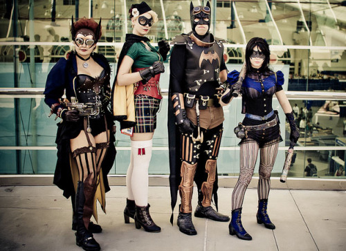
With the increase in the visibility and popularity of cosplay (short for costume play), I thought we could look at an example in the collection to show the long tradition of dress-up in western culture. In the past, people from other cultures, and their dress, were extremely interesting to western culture. These cultures were new to the west, so every aspect of them was examined, usually ending in their commodification. Though the word cosplay wasn't coined until the 1980s, people have been dressing up for hundreds of years. Cosplay, however, has been gaining far more visibility these days due to television shows, such as SyFy's Heroes of Cosplay, and increased fan-creator interaction, such as how Marvel encourages cosplayers to send in photos. Conventions have always been around, but they have been gaining more media attention, such as articles in the New York Times about major conventions and their most recent photography project showing cosplayers in their homes.

Photo by Mike Rollerson, DC Steampunk Cosplay

When looking at current cosplay, one notices that it goes through trends, just like fashion. One of the current trends is idealized historical clothing, as well as more specific niches, such as steampunk, which usually consists of Victorian dress combined with antique-looking technology. People even expand upon the theme to create steampunk cosplays of more generic costumes, such as well-known superheroes.

Clockwork Butterfly, Adventurer Botanist

This drawing, entitled “Standing Figure in Oriental Dress” is an example of how Westerners interpreted, or cosplayed, the foreign dress they were encountering. The dress and customs of the places visited were usually shown through drawings and travel accounts. Those who had traveled to the east often had images made where they were wearing the costume of the country they had traveled to. These images served as both souvenirs and as tools to teach others about the culture that they had visited. These images were not always accurate. Oftentimes the artist or the sitter would create an outfit from various pieces of dress to create an image that they found pleasing. Even an image of someone from that region might be constructed.
Of course, cosplayers put much more work into their outfits than that. Not only is lots of time put into their creations, but unlike westerners playing at dressing like foreigners, cosplayers strive to make their costumes as close to the source material as possible. However, not all cosplay has a source material or is true to the source material. Reinterpretation of characters and costumes, as westerners did with foreign dress, allows for creativity and a personalized element in cosplay. Cosplay isn't just about accuracy, it is also about creativity and self-expression.

Looking at the items in the Cooper-Hewitt's collection, what would you most like to cosplay as?

Museum Number: 
1958-143-6

When you need to keep your matches dry...

$
0
0
Elizabeth Chase
Matchsafe, "Cawston Ostrich Farm, South Pasadena, California", ca. 1900. Gift of Stephen W. Brener and Carol B. Brener. 1978-146-68.

Matchsafes can be considered a type of travel case. In about 1830, the first friction matches were invented, and matchsafes, usually stashed in a man’s vest pocket or attached to a watch chain, were designed to keep matches dry at a time when they were vital for lighting kitchen stoves as well as cigars, pipes, and cigarettes, as smoking became an increasingly integral part of the social scene during the second half of the nineteenth century. This particular matchsafe features an advertisement for the Cawston Ostrich Farm, which opened in South Pasadena, California, in 1896 and became a world-class tourist attraction. Matchsafes became miniature billboards for a wide variety of manufacturers and other businesses, which contributed to their popularity during the late nineteenth and early twentieth centuries.

Tags: 
Museum Number: 
1978-146-68

A glimpse into Gerald Gulotta's design process

$
0
0
Gail Davidson
Drawing, "Designs for Flatware, including Axis", 1989–90. Gift of Gerald Gulotta. 2009-16-16.

Gerald Gulotta became an established freelance designer of ceramics, glassware, silver and stainless steel cutlery during the 1960s and 1970s. His sleek, slender, elegant tabletop designs look as contemporary today as they did during the height of his career. The Drawings, Prints and Graphic Design department recently acquired seven Gulotta drawings of stainless steel flatware. Three drawings document part of the design process for Espagña (designed 1968-70 and produced 1973-75) by La Industrial Mondragonesa, Portugal, the earliest of Gulotta's cutlery designs in the collection. These comprise two drawings for the salad fork and knife, and fish knife; and one Photostat for the soup spoon whose shape and profile has been cut out of the sheet. 

One sheet and a cut out knife relate to the steak knife for the Iona pattern, designed in 1979 and manufactured in 1980 by Lauffer. Two final drawings (one is double sided), which are the most interesting and appealing of the sheets, are filled with a variety of sketches. The verso of one sheet has designs for knives as well as a fork and spoon related to Iona, plus other designs similar to the Chromatics pattern. The recto of this sheet, however, shows designs for the knife (in different positions) for Rondure, produced 1998 by Dansk. The final sheet, seen above, shows Gulotta thinking about the concept of twisting the knife blade and handle applied to many different patterns including Axis, designed 1980-90 and produced in 1992 by Dansk, as well as several designs for forks. These drawings, seen together with the related patterns in the collection, are invaluable documents for understanding Gerald Gulotta's working process for designing cutlery.

Museum Number: 
2009-16-16

Embracing spontaneity and chance

$
0
0
Susan Brown
Textile, "Seismic (angular)", 2010. Gift of Tillett and Rauscher, Inc. 2011-33-2.

TAR/Tillett and Rauscher Inc., founded in 2006 by Seth Tillett and Nicole Rauscher, is an experimental textile hand-printing studio in Harlem.

Tillett comes from a long line of calico printers in England, and grew up in his parents’ live/work studio on the Upper East Side of Manhattan. His parents, D.D. and Leslie Tillett, of Tillett Fabrics Inc., produced custom textiles for the Jackie Kennedy White House, Babe Paley, and other influential clients. They were also artists and experimenters, and developed a number of unique printing techniques, such as the drag-box, a hand-made tool for creating stripes and plaids without the use of a screen.

Seth Tillett has worked extensively in film, dance and theater as a dramaturge, set and lighting designer, in addition to creating installations. In 2000, he met Nicole Rauscher, a dancer and choreographer, and the two began collaborating on installations and performances involving graphics and textiles.

In 2003, the pair moved to New York City, and Rauscher apprenticed herself to D.D. (Doris) Tillett for the last years of her life, while running Tillett Fabrics. Rauscher continues to print Tillett Fabrics designs on request, for interior designers who have been clients for decades. But in 2006 Seth and Nicole founded TAR to develop their own experimental approaches.

Seismic (angular) was designed and produced by TAR in response to the 2010 earthquake in Haiti. It was made using a notched rubber blade to hand-pull the narrow stripes of deep blue across the bright blue cotton chintz ground. Working in tandem across the printing table, Rauscher and Tillett manually jerk the blade at regular intervals, creating a fabric with an architectonic feeling, and giving the illusion of three-dimensional vertical columns.

The range of techniques is so hand-intensive and the results so unique that they call into question the use of the term printing, which implies fast, cheap repetition. By creating tools and techniques with which the design is created directly on the fabric, the pair actively seek to create non-repeating, non-repeatable patterns which embrace spontaneity and chance.

Museum Number: 
2011-33-2

Body Odor and Sticky Feet

$
0
0
Annie Hall
Telephone, "Trimline Phone". Designed by Henry Dreyfuss, 1968. Gift of Henry Dreyfuss. 1972-88-179-1.

What do sticky feet, body odor, and cracked, sweaty and saggy skins have to do with our museum collection? A survey of plastic materials in Cooper-Hewitt collections, supported by the Smithsonian’s Collections Care and Preservation Fund, was recently conducted by a team of conservators. We saw and smelled many of these plastic deterioration issues—up close and personal.

The body of the Trimline telephone, designed by Henry Dreyfuss in 1968, is made from cellulose acetate butyrate (CAB). This thermoplastic polymer is composed of cellulose mixed with acetic acid and butyric acids. Deteriorating CAB gives off the unpleasant smell of butyric acid (a little like vomit). The phone also has small feet on the underside that have become sticky after forty years, as have the polyvinyl chloride (PVC) cords. This type of deterioration was frequently found within Cooper-Hewitt’s Product Design collection. It is most likely due to loss of plasticizers, originally added to the plastic during its manufacture to make the plastic more flexible. As the plastic ages, plasticizers migrate to the surface, making the surface sticky.

Detail of the foot and cord on the underside of the phone in its storage housing. Photo by Annie Hall

In order to address both these issues, the Trimline phone is now stored in a special housing. It has a silicon coated polyester film (Mylar) lining to prevent any sticking to the housing base and includes board impregnated with zeolites, which will absorb the butyric acid vapors and hopefully the smell.

At the end of the project, over 1,550 objects were surveyed and specific recommendations were made for future conservation treatments and storage improvements. While it may not be possible to stop the signs of aging, it is possible to slow them and we can now target our efforts to keep the collection young and beautiful, or at least polite and presentable.

Museum Number: 
1972-88-179-1

Little red devil

$
0
0
Greg Herringshaw
Sidewall, 2006. Robert Therrien. Gift of Jerry and Eba Sohn. 2007-6-4.

Robert Therrien is an American artist known primarily as a sculptor, but he has also worked with painting, drawing, printmaking and photography. His works contain everyday objects which he recycles and reinterprets while frequently challenging the notion of perspective.

Therrien was doing drawings and screen-printed art works incorporating the red devil subject matter in the late 1990s. The wallpaper design with the red devil follows the theme of the change of scale. The very small-scale devil is shown against a very coarse, loosely woven fabric, giving the impression the devil could climb the background pattern much like a rope ladder.

This paper was a private commission and was not produced with commercial production in mind. It was to be used and enjoyed by the homeowner and his guests. While this is unusual it is not without historic precedent. The majority of papers in Cooper-Hewitt's collection were mass produced for residential and/or commercial use but there are examples of hand-painted papers, as well as private commissions and limited production. This group would include papers produced for the Royal Pavilion at Brighton in the 1820s; six papers designed by Pugin around 1850 for the Houses of Parliament and other private commissions; and one of the most iconic wallpapers, Cow, designed by Andy Warhol in 1966, which was created as an installation piece for the Leo Castelli Gallery in New York City.

Museum Number: 
2007-6-4

The Swinger

$
0
0
Russell Flinchum
Camera, "Swinger", 1965. Henry Dreyfuss. Museum purchase through gift of Neil Sellin. 1999-2-4.

In 1960, Edwin Land, founder of the Polaroid Corporation, approached American designer Henry Dreyfuss regarding their cameras. The Automatic 100 Land Camera, which allowed the photographer to remove the developing print as soon as the picture had been snapped, was the first new product to result from their collaboration. It exemplified the successful integration of the industrial designer with a team of engineers, physicists, and specialists.

While Polaroid gained a reputation for innovations, Dreyfuss’s designers helped make this technology accessible to users. Cameras became easier to operate and less expensive, culminating in the Swinger (1965). Priced at under $20, it used an inexpensive black-and-white roll film and brought Polaroid photography to the broadest and largest audience it had ever enjoyed. Land, it was said, liked Dreyfuss because he “didn’t know what couldn’t be done.” The professional distinctions between engineers, designers, and scientists became irrelevant in the pursuit of Land’s vision of a single-lens reflex and litter-free instant camera that could produce photographs almost as rapidly as a button could be pushed, the SX70 of 1972.

Museum Number: 
1999-2-4
Viewing all 447 articles
Browse latest View live