Quantcast
Channel: object of the day – Cooper Hewitt, Smithsonian Design Museum

Jennifer Morla: Experimental Typography

0
0
In celebration of the milestone 20th anniversary of the National Design Awards, this week’s Object of The Day posts honor National Design Award winners.

What does “typography” mean to you? Does the word stir up contempt for Comic Sans and Papyrus, or does it conjure a death match between Times New Roman and Helvetica? For many of us, the word “typography” means “fonts.” Yet the art of typography encompasses much more than choosing typefaces. Designers use scale, spacing, layout, contrast, grids, hierarchy, and more to arrange content in meaningful and expressive ways. A typographic message can stand up and stand out—or gracefully recede to the background.

Jennifer Morla has experimented with typography since 1978, when she began designing motion graphics for a PBS television station in San Francisco. After founding Morla Design in 1984, she became a leader within the Bay Area’s dynamic design scene. Morla has used color, pattern, photography, and editorial wit to bring grit and sparkle to visual communications for consumer brands and cultural institutions. Morla has a special gift for typography. She mixes, matches, splices, and overlaps lines of text to generate provocative interpretations of art and ideas.

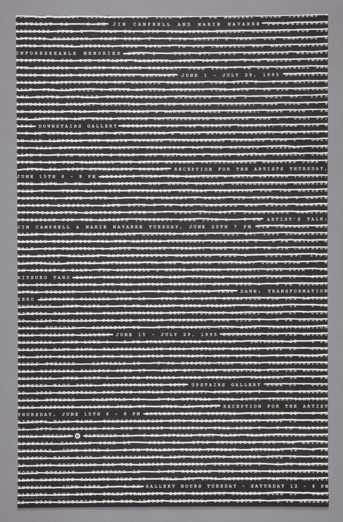
Cooper Hewitt recently acquired nearly two dozen posters and other works by Morla, who received the National Design Award for Communication Design in 2017. A group of black-and-white posters from the 1990s demonstrates her mastery of typography as an expressive medium. San Francisco’s Capp Street Project (now part of the Wattis Institute) offers residencies and exhibition opportunities to local artists. While traditional museum or gallery posters feature reproductions of artists’ work, Morla uses type to embody themes and concepts. For the exhibition “Unforseeable Memories” (1995), she covered the poster with a field of small type, printed in all caps in a simple, monospaced typewriter font—and then she crossed out most of the text. All that remains visible are the particulars concerning the event. Paradoxically, the obliterated lines serve to highlight the remaining text, functioning like underscores. In another poster created the same year, overlapping words convey collaborations among a group of artists. Individual names emerge from the crowd.

For a campus gallery at the California College of Arts and Crafts, Morla assembled fragments and shadows of letterforms into vibrant bursts and clusters. Crisp horizontal bands of text stand out against these gestural masses to announce the title and dates for each exhibition. As a series, these black-and-white posters gave the gallery a recognizable voice while singing different melodies.

Morla’s posters contributed to the flourishing of typographic experiment during the dawn of digital typography. The new design tools that came of age in 1990s freed designers to manipulate type in direct and immediate ways. In place of manual cut-and-paste and costly galleys of typesetting, designers could manipulate the scale, orientation, and sharpness of text and image. Philosophically, designers were questioning modernism’s emphasis on simple, direct messaging in favor of layered complexity. Typography could challenge readers to look closer. In this influential body of work, content becomes visible against a turbulent sea of form and counterform, assertion and deletion.

Ellen Lupton is Senior Curator of Contemporary Design at Cooper Hewitt, Smithsonian Design Museum.


Weaving Wonders of Richard Landis

0
0

American weaver Richard Landis’s works are characterized by complex design systems that echo the logic of their construction with a limited vocabulary of materials, texture, geometric forms, and colors. From his earliest days at the loom, Landis decided he would work only in plain weave and within the opportunities offered by handwoven, loom-controlled design. He taught himself doubleweave to expand what could be achieved within his self-imposed boundaries.

Nucleus (1976) is a superb example of Landis’s technically and aesthetically disciplined handwoven double-cloth. It is a diminutive piece, only eighteen and three-quarters inches high by seventeen inches wide, woven in very fine cotton thread. Designed in collaboration with graphic artist Craig Fuller, it uses a visual program based on a grid of small squares, thirty across by thirty down.

It is woven in a classic “checkerboard” style of loom-controlled block double-cloth. Rather than using only two colors as in a traditional checkerboard, Landis uses a modulated palette of colors, inspired by the subtle tones of the desert landscape surrounding his Arizona home: black, white, grays plus several shades of blue and of its compliment, orange – twelve different colored threads in total.

Landis’s program allows for a balanced and systematic depiction of all seventy-eight possible tones and half tones that may be constructed from the twelve different color threads. The use of very fine, smooth threads woven in plain weave allows for the appearance of definite tonalities and the rendering of a perfectly flat colored surface. “…For while my medium is weaving, my formal concerns are those of a painter. The firm tabby surfaces I weave form a canvas,” Landis said. “In my work, the canvas is the painting.”[1]

In Nucleus the colored warps and wefts are precisely arranged, with a subtle symmetry. The warp threads in column one are the same colors as the weft threads in row one; the warps in column two are the same as the wefts in row two and so on across the weaving. Landis then alternates the warp and the weft respectively that appear in each square, in the same sequence, across the full width and height of the textile. Thus what might appear as a random arrangement of colored squares in the grid is in fact deliberate. As a result, the first row and the first column of squares as seen from each respective corner of the composition have the same color tones, similarly for the second row and second column, and so on, except that the warp and weft colors are reversed. So, for example, the fifth square in the first row is a half tone of blue warp and gray weft and the fifth square in the first column is a half tone of gray warp and blue weft. The diagonals are full tones. The resulting juxtaposition of different tonalities, as well as the changing orientation of the threads multiplies the color relationships, allowing for what Landis called “reiteration without repetition.”[2] Thus, even with its flat, uniform surface and repeated color sequences, Nucleus is a lively and energetic composition.

Richard Landis stopped weaving in 1995, but his disciplined geometry and masterful use of color are fresh and fascinating today.

Maleyne M. Syracuse is an avocational weaver and an independent art historian specializing in textiles and fine craft. She is President of the Board of Directors of Peters Valley School of Craft in Layton, NJ and a past Treasurer of the Textile Society of America.

[1] Richard Landis, Artist’s Statement, quoted in Joanne Rapp Gallery, Richard Landis, undated. Object/Artist Files, Textile Department, Cooper-Hewitt National Design Museum, New York, NY.

[2] Richard Landis quoted in Barbara Cortright, “Richard Landis: The Prismatic Needle’s Eye,” ArtSpace (Fall 1979), 37.


Latest Images